The Challenge
As Redbox Mobile evolved from an App Store Optimization (ASO) agency to a full-scale app growth consultancy, its legacy identity no longer represented its maturity or scope. The existing brand visual felt outdated, limited to ASO services, and lacked consistency across global communications.
Core challenges included:
- Repositioning the brand in a crowded performance marketing landscape
- Creating a future-ready visual identity reflecting both technology and creativity
- Retaining brand equity while projecting innovation
“We weren’t just designing a logo; we were redefining a decade of credibility.”
The Strategy
We began with a consultancy-first approach, diving deep into the brand’s DNA through workshops, stakeholder interviews, and competitor analysis.
Discovery Goals:
- Understand Redbox’s value proposition and cultural identity.
- Decode client perception versus market positioning.
- Identify future growth directions within app marketing and analytics.
Strategic Direction:
We repositioned Redbox as a holistic growth consultancy — where performance meets creativity.
Our approach was rooted in three brand pillars:
- Performance Precision — measurable impact and growth data
- Creative Intelligence — design thinking applied to marketing science.
- Collaborative Innovation — blending human expertise with automation.
This positioning informed every creative decision — from the color palette to typography — ensuring each element communicated both trust and transformation.
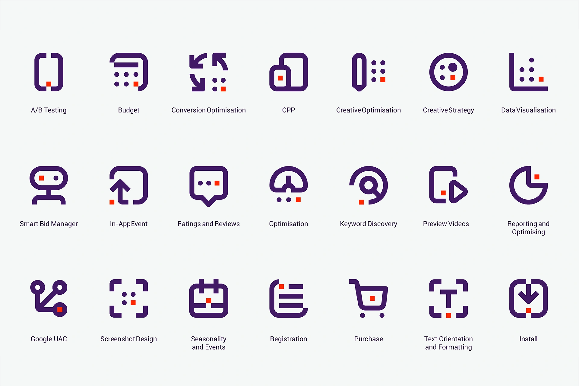
The Execution
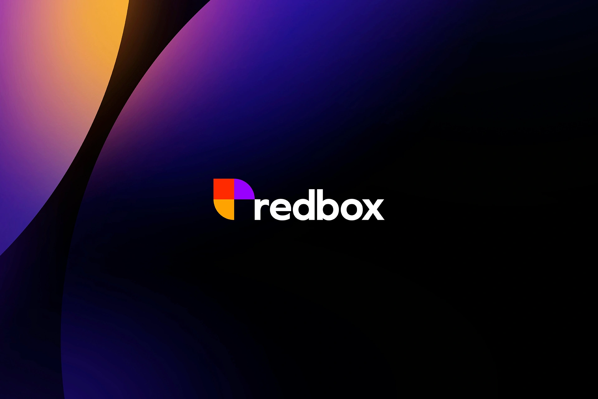
The new logo mark merges three geometric modules, forming a dynamic cube — symbolizing unity, evolution, and multidimensional growth. Each quadrant represents one Redbox strength: creativity, technology, and performance.
Typography:
A bold, clean sans-serif typeface reflecting technical expertise and modern minimalism.
Brand Language:
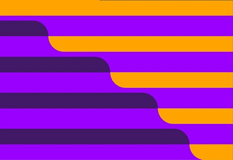
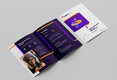
We extended the identity into a vibrant design system, using layered shapes, data-driven visuals, and modular grids to represent app ecosystems and growth analytics. “Every visual decision was intentional — designed to communicate confidence, scalability, and digital mastery.”
Color Palette:
- Red: Passion and performance
- Amber: Growth and energy
- Violet: Creativity and innovation
- Deep Navy: Stability and trust

Red
HEX: #FF2D00CMYK: 0,85,80,0RGB: 255,45,0
Orange
HEX: #FFA000CMYK: 0,35,100,0RGB: 255,160,0
Purple
HEX: 8200FFCMYK: 70,90,0,0RGB: 130,0,255
Deep Indigo
HEX: #251041CMYK: 55,70,0,70RGB: 37,16,65
White
HEX: #FFFFFFCMYK: 0,0,0,0RGB: 255,255,255
Light Grey
HEX: #EDEEEECMYK: 0,0,0,10RGB: 237,238,238
Mid Grey
HEX: #96969ACMYK: 0,0,0,40RGB: 150,150,154
Dark Purple
HEX: #3C1E64CMYK: 30,77,0,63RGB: 60,30,100
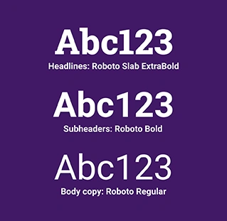
Headlines:
Roboto Slab ExtraBold
A B C D E F G H I J K L M N O P Q R S T U V W X Y Za b c d e f g h i j k l m n o p q r s t u v w x y z1 2 3 4 5 6 7 8 9 0 . , ? ! @ # $ % & *
Paragraphs:
Roboto Bold & Regular
Lorem Ipsum is simply dummy text of the printing and typesetting industry. Lorem Ipsum has been the industry's standard dummy text ever since the 1500s, when an unknown printer took a galley of type and scrambled it to make a type specimen book. It has survived not only five centuries, but also the leap into electronic typesetting, remaining essentially unchanged. It was popularised in the 1960s with the release of Letraset sheets containing Lorem Ipsum passages.